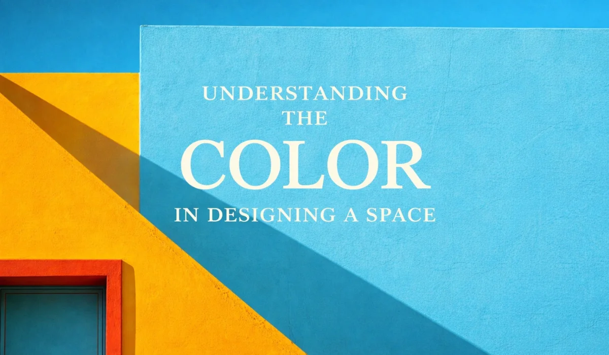
Colour is one of the most powerful tools in interior design—yet it’s often treated as an afterthought. We choose colours based on trends or personal preference, without realizing how deeply they influence mood, perception, and behavior. This is where colour theory comes in. Understanding colour theory allows you to design spaces that don’t just look good, but feel right.
Colour Shapes Emotion and Mood
Every colour evokes an emotional response. Warm colours like red, orange, and yellow bring energy, warmth, and stimulation. Cool colours such as blue, green, and purple create calm, balance, and relaxation. When applied intentionally, colour can set the emotional tone of a space—whether it’s a lively living room, a focused workspace, or a restful bedroom.
Designing without considering emotional impact can lead to spaces that feel overwhelming, dull, or disconnected.
Colour Influences How We Perceive Space
Colour theory helps designers manipulate the visual perception of a room. Light colours make spaces feel open and airy, while darker shades add depth and intimacy. Cool tones can make a room appear larger, while warm tones create a sense of closeness.
Strategic colour placement can visually raise ceilings, widen narrow rooms, or define zones within open-plan layouts—all without changing the physical structure.
Harmony and Balance Create Visual Comfort
A well-designed space feels cohesive, not chaotic. Colour theory introduces concepts like complementary, analogous, and monochromatic schemes that help achieve balance and harmony. When colours work together, the space feels intentional and comfortable rather than overwhelming or disjointed.
This harmony allows the eye to move smoothly through the space, creating a sense of order and calm.
Colour Supports Functionality
Different spaces serve different purposes, and colour plays a key role in reinforcing that function. Energizing colours can enhance creativity and productivity in offices or studios. Soft, muted tones encourage rest and relaxation in bedrooms and wellness spaces. Social areas benefit from warm, inviting palettes that promote connection and conversation.
Choosing colours aligned with a room’s function ensures the space supports how it’s meant to be used.
Cultural and Personal Meaning Matter
Colour isn’t universal—its meaning can vary across cultures and personal experiences. What feels comforting to one person may feel unsettling to another. Colour theory helps designers understand these nuances, allowing them to create spaces that feel emotionally and culturally relevant.
Personalized colour choices make a space feel authentic, lived-in, and meaningful.
Light and Material Change Colour Perception
Colour never exists in isolation. Natural and artificial lighting, textures, and materials all affect how a colour appears. A shade that looks perfect on a sample may feel entirely different once applied to walls, fabrics, or finishes. Understanding colour theory helps designers anticipate these changes and make informed decisions.
This knowledge prevents costly mistakes and ensures consistency throughout the space.
Thoughtful Colour Design Elevates the Experience
When colour theory is applied thoughtfully, design becomes more than decoration—it becomes experience-driven. The right palette can calm the mind, energize the body, and create emotional connection. It turns a space into something you don’t just see, but truly feel.
Final Thoughts
Colour theory matters because design is ultimately about people. It’s about how spaces make us feel, move, and live. By understanding the science and psychology behind colour, designers can create environments that are not only beautiful, but intentional, functional, and deeply human.
In interior design, colour isn’t just visual—it’s emotional. And when used wisely, it transforms a space from ordinary to unforgettable.
Contact Details
- +91 8625098418
- sociableweavers30@gmail.com
- kakkad la vida society, Old baner balewadi road, balewadi. 411045